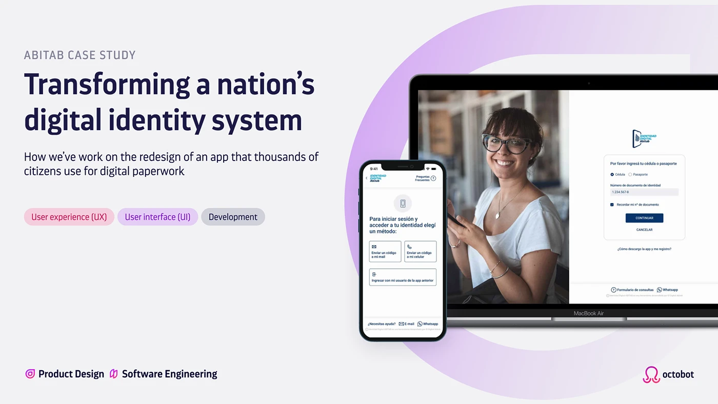
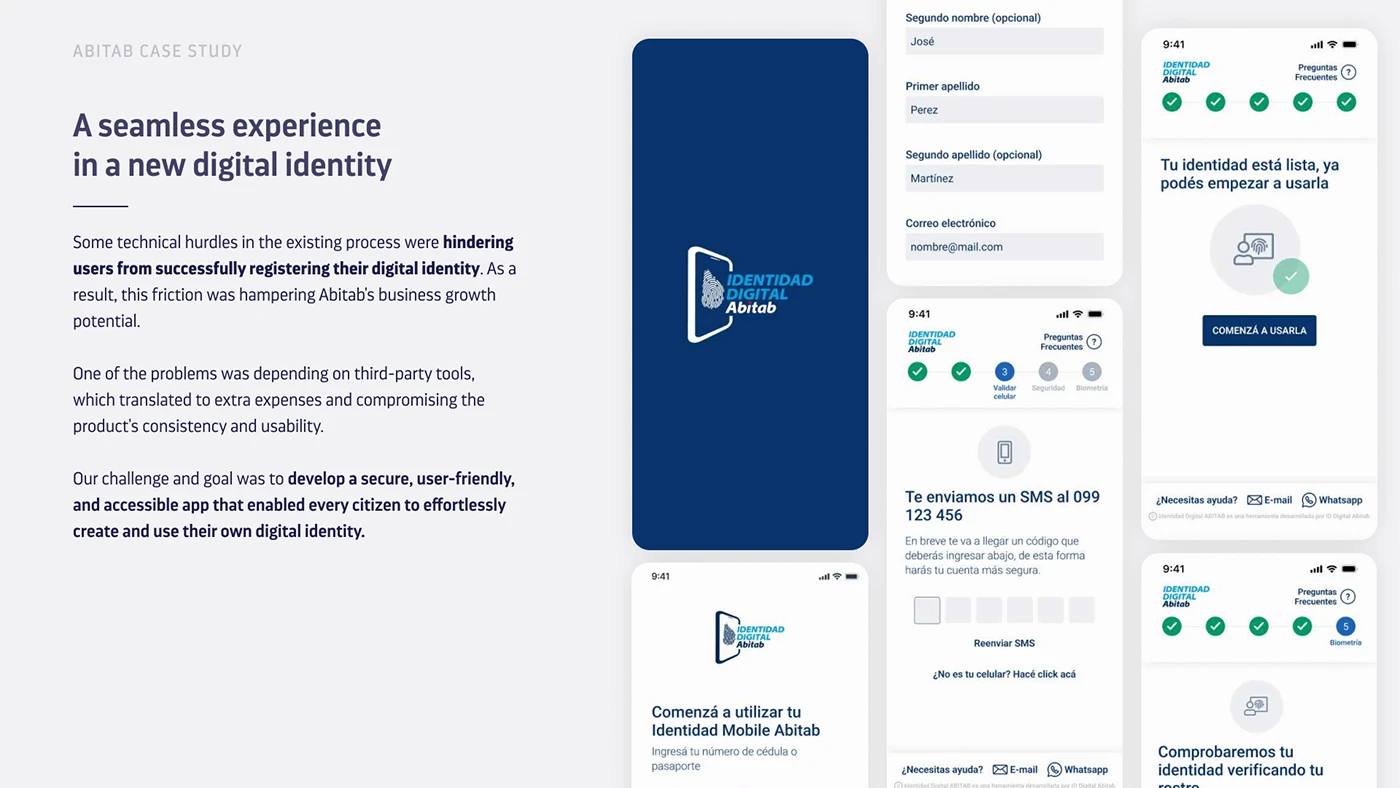
Identidad Digital — App Redesign
Redesigning a critical app used by thousands of Uruguayans for health, financial and government transactions — improving an experience that had to work for everyone, regardless of age or digital confidence.
I joined the project as lead designer on the redesign — owning the experience from research through to final UI and usability testing.
Identidad Digital is a digital identity app developed by Abitab, one of Uruguay's most established financial services companies. The app allows users to perform critical transactions related to health, financial and government services — making it an essential tool for thousands of Uruguayans across all age groups and levels of digital experience. The original version had significant usability problems and the team had clear data showing where users were struggling. The design system was predefined and aligned to Abitab's other products, which meant visual flexibility was limited. The real challenge was improving the experience within those constraints.
Flows the team considered simple were causing significant confusion — particularly among older users and people with limited digital experience. Users were dropping off, making errors, and losing confidence in an app they depended on for essential services.
We simplified every high-friction flow, rewrote microcopy from scratch, and rethought error messages end to end. Every decision was grounded in behavioral data and validated through usability testing before launch. The result was version 2.0 — a redesign built on a foundation solid enough that the team is still using it two years later.
Given the scale and sensitivity of the product — used by people for critical life transactions — every decision had to be well-informed. We combined behavioral data, stakeholder workshops, and real user interviews before writing a single line of UI. What the research revealed shaped the entire direction of the redesign.
Behavioral data revealed exactly where users were dropping off and which flows were generating the most friction across the app.
Internal sessions with Abitab stakeholders aligned the team on priorities and ensured the redesign direction matched business and regulatory requirements.
Interviews with current and potential users surfaced real pain points — including the key discovery that seemingly simple flows were causing significant confusion.
Simplified flows, rewritten microcopy, and fully rethought error messages — all within Abitab's predefined design system. Every change had a clear rationale rooted in research.
Usability tests with real users before launch confirmed the redesign was working. We iterated until the experience was genuinely better — not just visually updated.
We started by analyzing behavioral data to understand where users were dropping off and what flows were generating the most friction. That data gave us a precise map of the problem before we spoke to a single user — and prevented us from designing based on assumptions.
We ran internal workshops with Abitab stakeholders to align on priorities, then conducted interviews with both current and potential users to understand their real pain points. Combining quantitative data with qualitative insight gave us the full picture — where users struggled and why.
What surprised us during research was that flows we considered simple were actually causing significant confusion — particularly among older users and people with limited digital experience. That finding shaped the entire direction of the redesign: simplify steps, rewrite microcopy from scratch, and rethink error messages from the ground up.
Before launching the new version we ran usability tests with real users to validate that the changes were working. We iterated based on that feedback until we were confident the experience was genuinely better — not just visually updated. Only then did we ship.
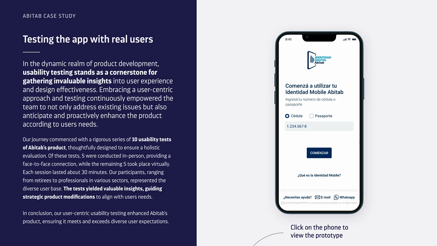
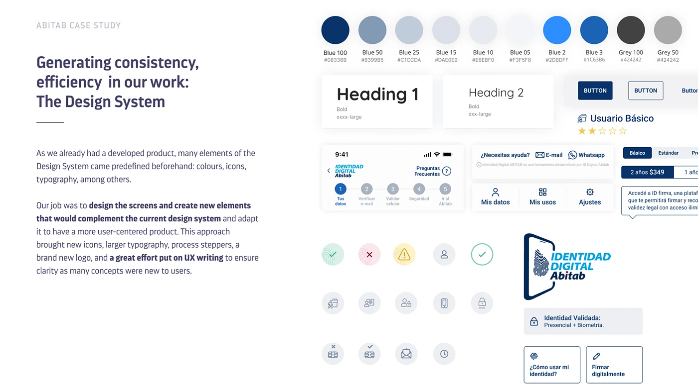
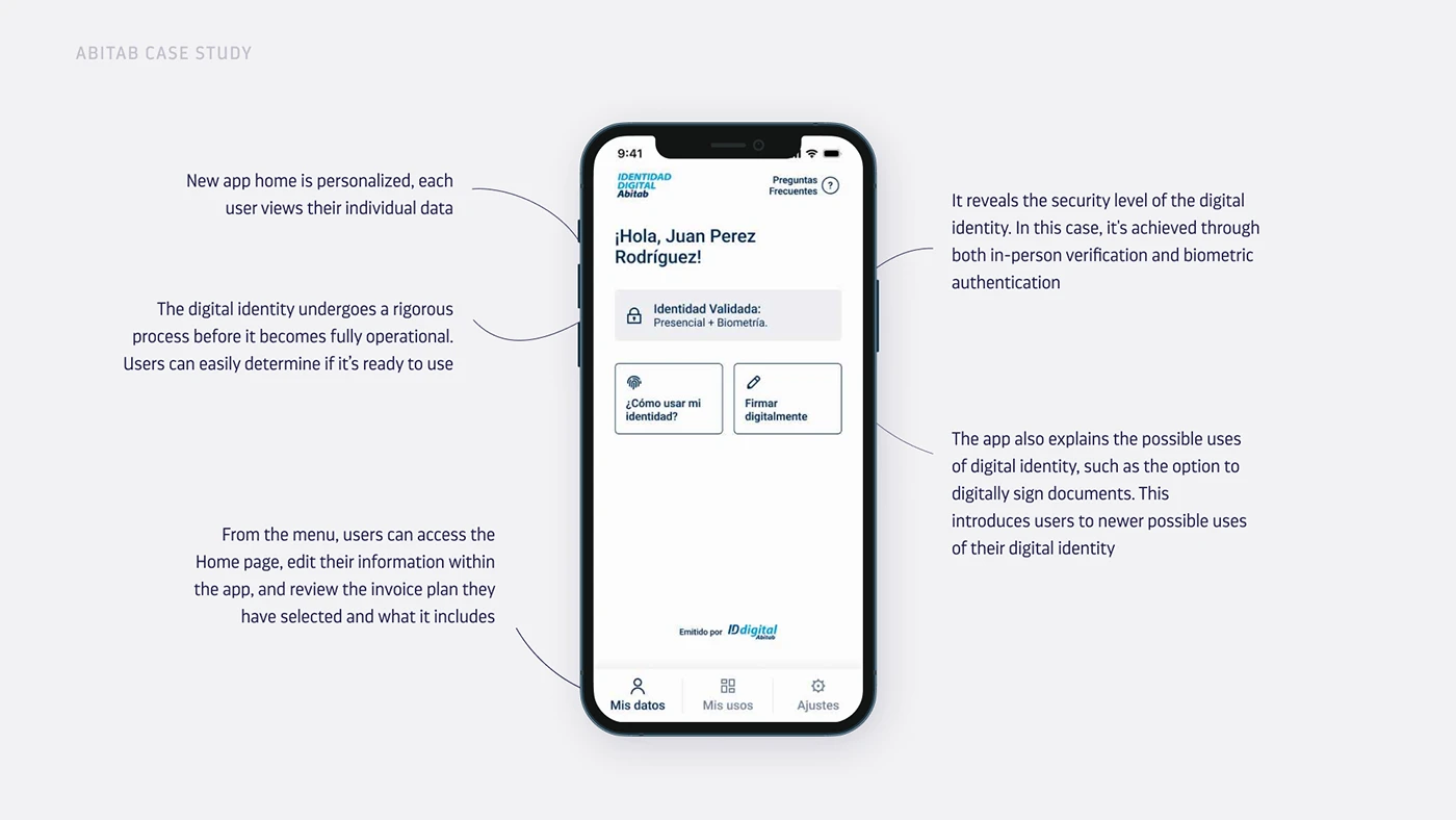
A complete redesign within Abitab's predefined design system — every screen, flow and component rebuilt with real users in mind.
"Two years later, the team that took over is still building on the same foundation we created."
The redesign launched as version 2.0 of the app. User feedback after launch confirmed that the experience had improved significantly — particularly for the flows that had been generating the most friction. What I'm most proud of is that the foundation has lasted. To me that's the real measure of good design: not how it looks, but how solid and purposeful it is.